Top 5 Bad UX Designs You Should Stop Making in 2023
Learn the top 5 bad UX design you should stop making in 2023 and improve your product experience starting now!
Written by:
David Yap
Mar 20, 2023
Last Update:
Sep 24, 2023
5 mins read
2023 is the year for UX and most organisation are still making these common mistakes on UX design and UI design alone is not enough.
Poor Navigation
Inefficient User Interaction
Overwhelming Content
Lack of access
Inconsistent Design
Remember how Apple's storage management system got a lot of bad press for a long time? Apple and the iPhone, yes - they also had their share of bad UX examples.
'Poor design is not only bad for the eyes, it's horrible for business.' - Josh, CMO of Zensite
In the past, iPhone users often struggle to understand how to manage their files and storage due to the confusing user interface and user flow of their file system.
Apple's storage management system problem in the past made a lot of people complain. Pic credit: Quora
So, this made their users frustrated, and turned to other ways to store their files, like Dropbox or Google Drive. Some even stopped using Apple's storage management system altogether.
No matter what, bad user experience (UX) can be bad for your business.
So, in this article, we're going to help you explore what are the top 5 app with bad UX categories alongside some concrete examples for you to refer to.
You'll also get to know how to convert these bad UX website examples into good ones, as we'll share a few good UX design examples as well.
Let's get started!
Introduction to bad UX design
Bad UX refers to any design that fails to provide users with a positive experience.
To be honest, users experience bad UX, or bad user experience, on a regular basis.
It can encompass a range of issues, from slow pages to broken links, to pop ups that interrupts.
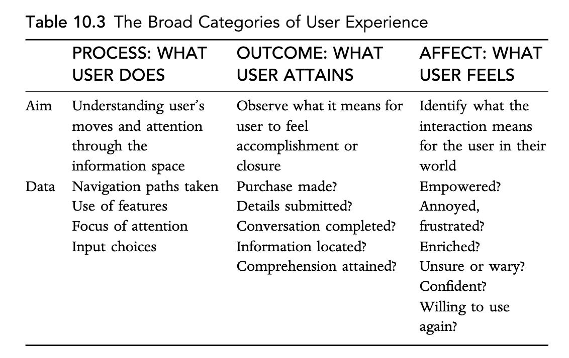
Broad categories of user experience by Andrew Dillon
So, a bad UX means the UX design:
does not understand your user's moves and attention (process)
makes users fail to get what they want (outcome)
leads to the user feeling negatively (affect)
Common bad UX mistakes
Mistake #1: Poor Navigation
That is a poor navigation issue.
Poor navigation is a common bad UX mistake that can hinder users from achieving their goals, and ultimately lead to frustration and loss of customer loyalty.
Poor navigation examples
One example of poor navigation can come from the menu, which is supposed to help users navigate the entire website easily.
Some examples of bad navigation on websites. Pic credit: Neil Patel
You cannot have a low-quality website design and poorly functioning links.
The menu items must be related, and to ensure great navigation, fix all broken links on the web page.
Mistake #2: Inefficient User Interaction
This includes slow page loading times, mandatory registration, complicated forms, and unclear calls to action.
Inefficient user interaction can have a negative impact on your businesses and organizations.
One of the famous UX failures is complex passwords with numerous requirements.
While this was meant to provide added security, it hindered users from logging in, resulting in frustrated customers and decreased customer loyalty.
Inefficient User Interaction examples
In the world of online stores, a booking platform for hotels and resorts had a classic password kerfuffle that made it difficult for new users to create an account.
The platform required complex passwords and mandatory registration, resulting in a low conversion rate for new users.
Another famous poor interaction is simply slow pages. This is a major headache.
The majority of customers now will simply leave the website if it loads slowly.
You may like this Dinosaur on Google pages, but you'd leave the website you're visiting if it's too slow. Pic credit: Tom's Guide
Mistake #3: Overwhelming Content
This includes cluttered screens, excessive pop-ups, intrusive ads, and irrelevant information.
Overwhelming content refers to information, graphics, or media that can confuse or frustrate users, making it difficult for them to navigate a website or application.
It can lead to a poor user experience and ultimately hinder conversions or engagement.
Overwhelming content makes your users not focused. Pic credit: Skyward
In his book "Don't Make Me Think," Steve Krug emphasizes the importance of simplicity in web design and avoiding overwhelming content.
He stresses the importance of designing for the user, with clear navigation and concise content.
Another example of overwhelming content can be found on some e-commerce websites, where product pages can be cluttered with too much information and media.
This can lead to decision fatigue and ultimately hinder the conversion rate.
Instead, product pages should be optimized with relevant and essential information and media to help users make informed decisions.
Overwhelming Content examples:
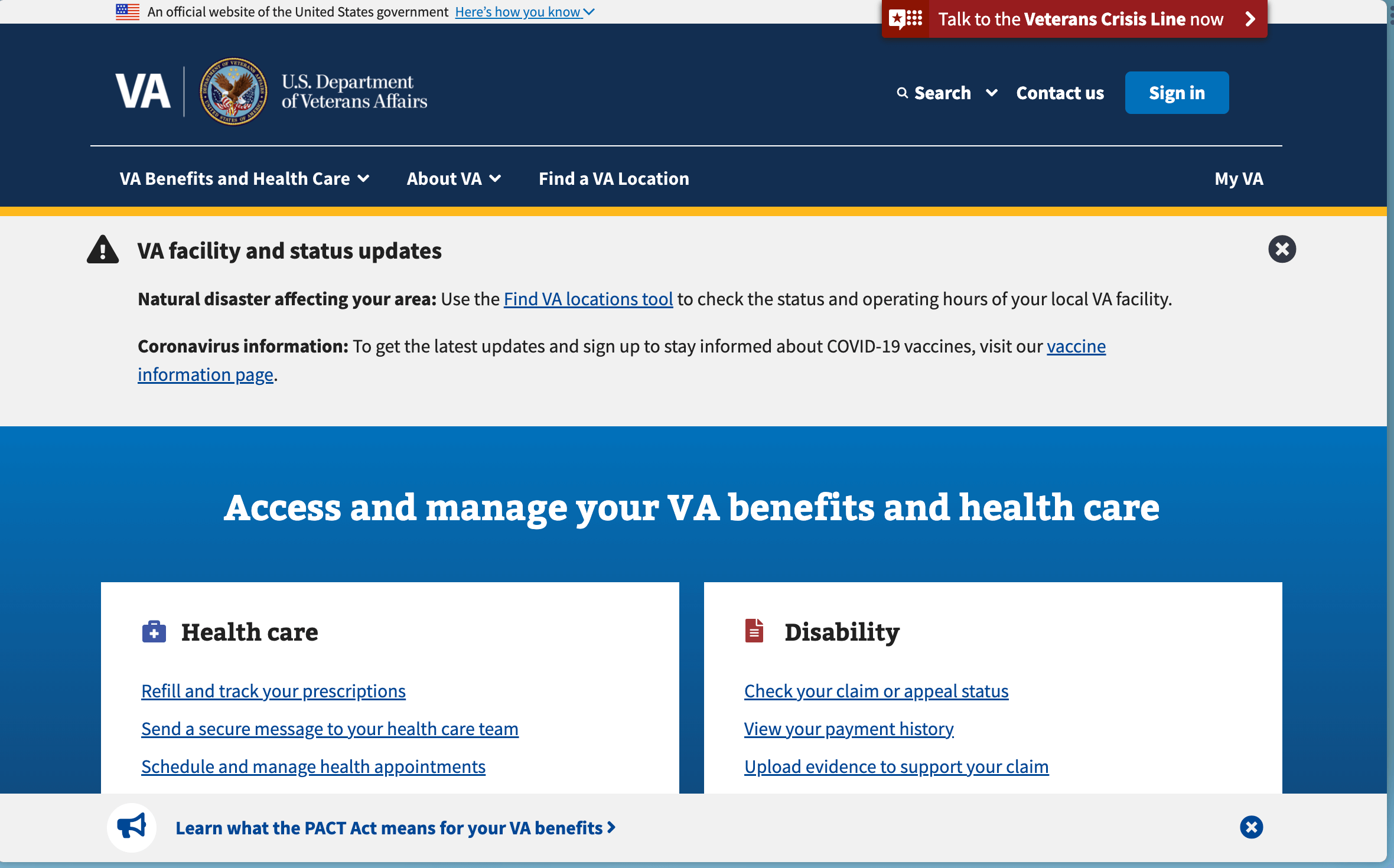
One example of overwhelming content can be found on the website of the US Department of Veterans Affairs.
The website shares a lot of information about veteran benefits and services, which is important and helpful for veterans and their families.
But, the majority of their information is difficult to navigate. They have multiple levels of menus and submenus, and long blocks of text that are difficult to digest.
So this is bad UX as the visitors, older people, what's more, may struggle to find the information they need there.
Mistake #4: Lack of accessibility
Lack of accessibility is a common bad UX mistake where websites and digital platforms are not designed to be easily accessible for all users, including those with disabilities.
This could mean that the website is not optimized for screen readers or doesn't have proper color contrast for visually impaired users.
It could also mean that the website is not keyboard navigable, which can be a major issue for users with motor disabilities.
If you look at the Web Content Accessibility Guidelines (WCAG), websites should be designed to be accessible to users with disabilities.
This includes features like alternative text for images, proper heading structure, and color contrast ratios.
In addition, websites should be keyboard navigable and offer captions or transcripts for audio and video content.
So, by not designing for accessibility, businesses and organizations are potentially alienating a large portion of their potential customers.
Lack of Accessibility examples
One example of how lack of accessibility can impact a business is in the case of Domino's Pizza.
This case even made it to the US Supreme Court.
This happened as the Court declined to hear an appeal from the pizza chain regarding a lawsuit that was filed against them for violating the Americans with Disabilities Act (ADA).
Guillermo Robles, a blind Californian, who uses screen readers to access the Internet, can place an order neither on the app nor on Domino's website. Pic credit: ArsTechnica.
The lawsuit claimed that Domino's website and mobile app were not accessible to visually impaired customers, as they could not use screen reading software to navigate the site and place orders.
As a result, the lack of accessibility hindered customers from using the service and impacted the brand's reputation.
Mistake #5: Inconsistent Design
Inconsistent design is a bad UX mistake that can confuse your users, undermine brand trust, and lead to frustration.
It refers to the use of different styles, layouts, colors, fonts, and graphics across different web pages, sections, or elements of a website or app, without any apparent rationale or consistency.
Inconsistent design can also cause confusion, and may even cause some users to abandon the site altogether.
Moreover, inconsistent design can damage the brand's reputation and undermine customer loyalty.
Users expect a website or app to have a consistent look and feel, as it conveys professionalism, attention to detail, and a sense of trustworthiness.
If a brand fails to provide this, it can lead to negative reviews, lost sales, and lower customer retention rates.
Inconsistent Design examples
One example of inconsistent design is the website of a well-known fashion retailer.
On the homepage, the brand's logo is displayed in bold letters in the upper left corner, but on the "About Us" page, it is placed in a smaller size and centered.
The navigation bar at the top of the homepage uses black letters on a white background, but on the "Contact Us" page, it is reversed, making it difficult to read.
The fonts and colors used in the product descriptions and pricing vary widely, making it hard to compare and understand the offerings.
Bad UX examples in different industries
You can find bad UX design examples in many industries, from e-commerce to government services.
Let's get started.
Government services
We are putting this first as major UX issues are from government websites.
Bad UX can have a significant impact on citizens who rely on these services.
One example of this is the Healthcare.gov website, which was launched in 2013.
The website was intended to provide an online marketplace where individuals could purchase health insurance plans.
But then, it was plagued with technical issues and a confusing user interface.
Users were met with long wait times, error messages, and broken links, making it difficult to enroll in a health insurance plan.
The website's poor design also made it challenging for users to understand the information presented to them.
The website was ultimately revamped, but not before damaging public trust in the government's ability to provide accessible and effective online services.
Another example of bad UX in government services is the U.S. Department of Education's Free Application for Federal Student Aid (FAFSA) website.
The FAFSA website is used by students and their families to apply for federal financial aid for college.
However, the website's design is also difficult to navigate, with confusing terminology and multiple steps that are not well-explained.
Users even reported their complaints as these problems to input their financial information and submit their applications have delayed in the financial aid process.
The website's poor UX has also been criticized for disproportionately affecting low-income and underrepresented students who may not have access to the resources or support necessary to navigate the confusing application process.
In both of these examples, bad UX has had real-world consequences for users who rely on these services.
Good UX design to follow: UK
Service industry
Other than the government websites, you can also see this issue in the service industry.
Take the aviation industry, bad UX can lead to confusion and delays.
For example, a major airline introduced a new self-check-in kiosk that was difficult to use, causing long lines and frustrated passengers.
The kiosk's interface was confusing and unintuitive, with unclear instructions and buttons that were too small and close together.
This resulted in a poor user experience and increased wait times for passengers.
Even the simple act of getting a haircut can be impacted by bad UX design.
One barber shop chain introduced an app for customers to schedule appointments and select their preferred barber.
However, the app was difficult to navigate, with confusing menu options and an unclear booking process.
Customers found it frustrating to use and reverted back to calling the barber shop to make appointments.
Good UX design to follow: Lufthansa booking platform.
Lufthansa makes it easy to find the language options - they detect locations automatically.
Even if a traveler isn't from the area, they won't have to worry about switching languages.
Product/ retail industry
In eCommerce, a bad user experience simply means lost sales and reduced conversion rates.
You can simply compare your experience while using Amazon and Alibaba.
Not only Alibaba is a foreign website (for people outside of China), but the layout is bulky and the options are too overwhelming.
Another classic bad UX example can be seen in the issue of QR codes for the menu in restaurants.
Not only do customers have to take out their phones to scan, but the menu can also load and be hard to read (compared to the normal big physical menu).
So, with a bad experience, not only they may not return, there are cases where customers simply walked out, and worse, leave negative reviews online.
This can damage the restaurant's reputation and ultimately lead to lost revenue.
Good UX design to follow: McDonald's - seamless online and offline UX design
Social businesses/ NGOs
Social businesses and non-governmental organizations (NGOs) play a crucial role in addressing social issues, and their online presence is just as important as any other organization.
Unfortunately, many of them suffer from a bad user experience too, making it difficult for users to engage with their services and contribute to their causes.
One example of a social business with poor UX design is a fundraising platform that connects donors with grassroots organizations.
The platform has a confusing interface, with too many buttons and links that lead to dead ends.
Donors have reported difficulty in finding the information they need to make donations, such as tax receipts and organizational information.
A poorly designed website can hinder their ability to achieve their goals, whether it is raising funds, increasing awareness, or providing services.
By investing in good UX, these organizations can create a more positive user experience and better achieve their missions.
Good UX design to follow: LaunchGood. Clean and straightforward UX.
Here we list down 5 bad UX impacts that would concern you.
Decrease profitability
Yup, surely it can have significant impacts on your business's profitability.
In his book "Don't Make Me Think," Steve Krug said that users should be able to easily navigate a website without having to think too hard.
So, if your customers have to think too long, chances are they will never buy.
In addition, bad UX can lead to negative word-of-mouth publicity, which can further damage a company's reputation, and of course, eventually your sales.
Low customer satisfaction
When a user encounters a bad experience on your website, it can lead to a low level of customer satisfaction.
This can make them frustrated, annoyed, or even angry with the product or service they are trying to use.
Ultimately, this can lead to negative reviews, reduced brand loyalty, and decreased revenue.
A good example of this is the healthcare industry, where a lack of user-friendly design can lead to frustration and dissatisfaction among patients.
One case study found that patients who used an online scheduling system that was difficult to navigate were less likely to make appointments in the future.
Additionally, patients who were not satisfied with the online experience were more likely to switch to a different healthcare provider.
Another example is the retail industry, where a poorly designed website can lead to a decrease in customer satisfaction.
If customers are unable to find the products they are looking for or have trouble navigating the checkout process, they may abandon their shopping carts and never return.
In fact, one study found that 88% of online shoppers said they would not return to a website after a bad user experience.
Dropped or lost market share
Bad UX can have a significant impact on a company's market share.
One of the bad user experience examples of this is the Hulu app, which has had several usability issues, including a tab for Live TV that is easy to accidentally activate and a banner image that covers content.
These issues hinder users' ability to find what they're looking for, and the narrow screen devices exacerbate the problem.
As a result, Hulu's market share has been impacted, with customers choosing other streaming services with better UX features.
How to avoid bad UX
So, now you know how bad UX is bad for business, how to not do it?
As we stated at the top of this article, this means you need to know its opposite: what makes a great UX. You can read our comprehensive guide on UX to help you there.
But in essence, to avoid making bad UX mistakes, it is essential to adopt UX principles.
Here as we wrote down 5 common bad UX mistakes, we help you by countering them with 5 how-tos as well.
Conduct user research and user testing
One way to prevent bad UX is through rigorous user research and testing.
UX designers should take the time to understand their target audience and optimize options based on their needs.
Usability analysis and testing can also help identify potential issues before they become major problems.
Follow UX best practices
By following UX best practices, designers can create designs that meet users' needs and expectations, resulting in higher customer satisfaction.
Following UX best practices also involves creating designs that are consistent across platforms and devices, using clear and concise language, and incorporating user feedback into the design process.
The Netflix autoplay feature is one of the good UX design examples of UX features that enhance the user experience.
Test and iterate
One of the best ways to avoid bad UX is to test and iterate your design.
This means getting feedback from your users and making improvements based on that feedback.
This can be done through surveys, focus groups, or usability testing.
Once you have feedback, iterate your design and test it again until you have a user-friendly design that meets your users' needs.
Companies like Blockbuster failed to do this, leading to their downfall.
Don't be like Blockbuster - keep on testing and improving. Pic credit: Reuters
Keep it simple
When it comes to avoiding bad UX caused by overwhelming content, one of the key solutions is to keep it simple.
This means designing user interfaces that are easy to understand and navigate, without overloading users with information or options.
One way to achieve simplicity is to use clear and concise language, avoiding jargon or technical terms that might be confusing to the average user.
Another approach is to use visual cues such as icons or images to help users quickly identify key functions or features.
A great example of keeping it simple is the design of the Google homepage.
The famous Google homepage: simple and straightforward
Rather than overwhelming users with information or options, Google has opted for a minimalist design with a single search bar and a few basic navigation links.
This simplicity makes it easy for users to focus on the task at hand – searching for information – without getting distracted by unnecessary clutter.
Get feedback from your users
Lastly, don't forget to gather feedback from your users.
By doing so, you can identify areas of your design that are causing difficulty or frustration for users with disabilities.
One way to do this is to conduct user testing with people who have different types of disabilities, such as visual impairments or motor impairments.
Ask users about their experience using your product and if they encountered any barriers or difficulties.
This feedback can help you make changes to your design to improve accessibility for all users.
In summary, bad UX is a widespread issue that can cause frustration and hinder users from accessing important information.
However, UX designers can prevent bad UX through user research and testing, as well as adhering to standard UX conventions.
Good UX can lead to positive user experiences, customer loyalty, and increased conversion rates.
Read our Quick Guide to UX for more.
Conclusion and key takeaways
In conclusion, bad UX can have a significant negative impact on business success.
It is avoidable but granted, you as a business owner or product designer should first know what is bad UX, so you can avoid them.
Call To Action
Contact us today to set up a consultation if you need help with your UX design or want to learn more about how to make your website or app better for users.
Our team of experienced UX designers can help you identify areas for improvement and implement strategies to provide a best UX for your users.
Unlock your business potential through design with us
Empower your business with tailored strategy, innovative design, and seamless Webflow development. Ready to take your company or startup to the next level? Enter your email to receive a free website checklist.
Thank you! Your submission has been received! We will email your the checklist as soon as possible
Oops! Something went wrong while submitting the form.
About our author
Written by
David Yap
David is the founder of Zensite, a product design agency based in Singapore. Since 2016, David have been involved in many UI UX related topics covering user experience, product design, digital experience and also founded Friends of Figma, a Figma Community in Malaysia.
Reviewed by
Fiha Febiala
Fiha is a passionate product designer hailing from Indonesia. With a background as a Frontend developer, Fiha transitioned my career into the dynamic world of product design. Fiha is dedicated to translating conceptual visions into user-friendly interfaces that resonate with users. In meantime, Fiha serve as a mentor, guiding aspiring individuals who seek to delve deeper into the realms of UI/UX.
Gain access to top-notch creatives from an experienced design agency through a flat monthly design subscription service. Start your design project with us today!
Thank you! You'll receive our next newsletter soon!
Oops! Something went wrong, please try again
SHARE
Contact us
We’d love to learn more about your company and how we can help you. Tell us about your project in the form, and we’ll put you in touch with the right team.
If you are looking for a retainer based service, please check out our design subscription.


.webp)
.jpg)
